

I Audited My Own Author Website. Here’s What Failed
Most author websites accidentally create confusion, friction, and weak reader connection. Here’s the practical, research-based audit I used to fix mine.

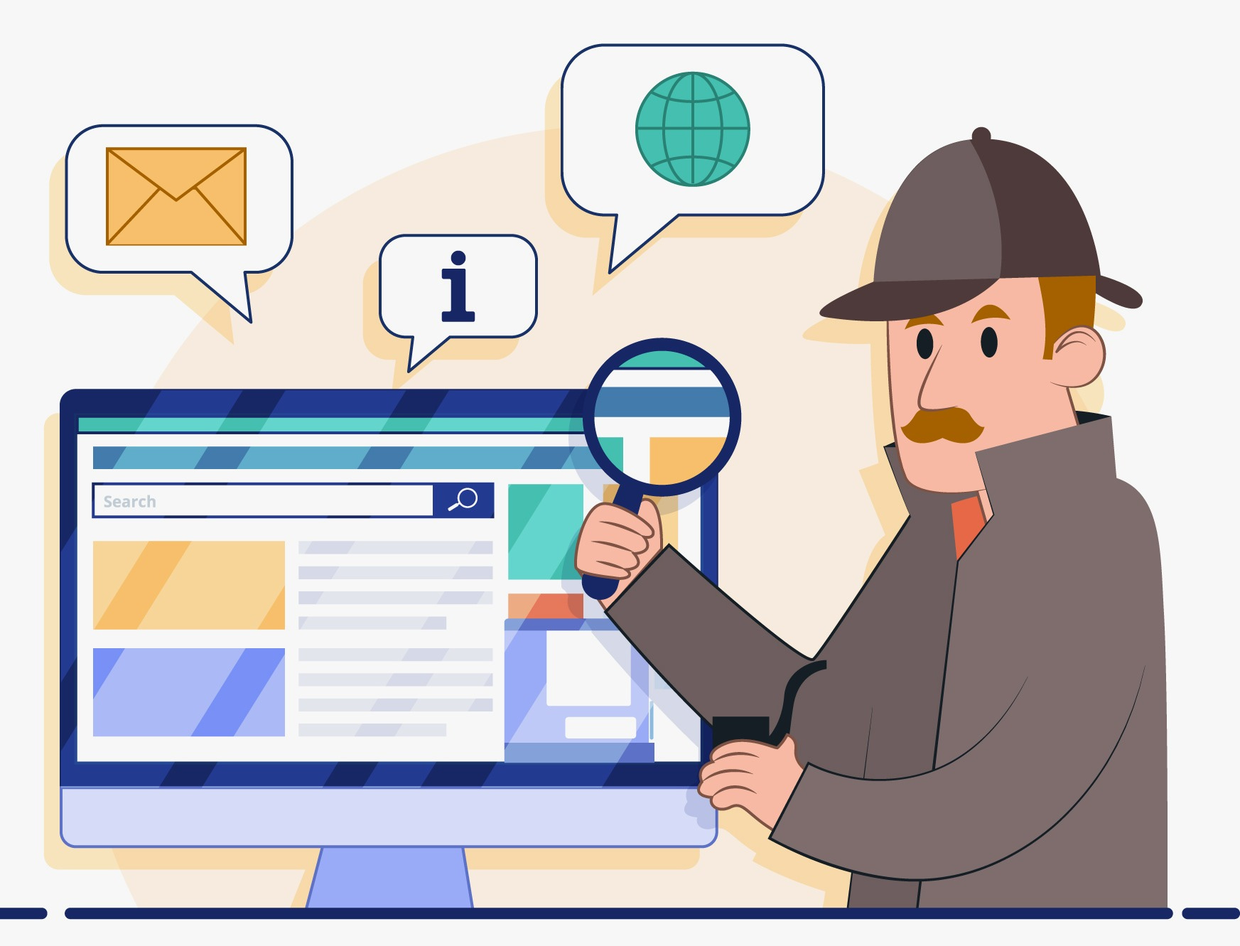
After writing about reader-focused author websites, I audited my own homepage using research-based marketing principles and UX principles. I wanted to see whether my website was creating the kind of reader experience I hoped it was creating.
Learn how to design your author website so it can do its job -

Spoiler Alert! It was NOT.
There was no catastrophic problem. Just several very common homepage mistakes that, together, hurt newsletter signups, reader retention, and long-term audience growth far more than most authors realize.
Common Author Website Mistakes
These small friction points weakened the overall reader experience:
Too many competing buttons
Unclear messaging
Weak newsletter positioning
Too many choices
Designed around selling books rather than guiding readers into my world.
Most author websites have these exact same problems.
As you read this post, open up your own homepage in another tab and audit it with me in real time.
Don’t look at your site like its creator; look at it like a distracted parent, a busy reader, a random internet stranger, or someone who’s discovering you for the first time.
In this post, I’ll walk you through:
the exact problems I found on my own homepage
why those problems hurt reader engagement
what consumer psychology research says about online behavior
and the practical changes to create a stronger reader journey.
I’m figuring this out, applying real research, and showing you exactly what I’m learning in practice. You will learn to see and fix problems almost every website has using:
emotional branding principles
cognitive load research
reader journey strategy
conversion psychology
and trust-building principles from online marketing research.
Problem #1: Too Many Competing Buttons
How many clickable buttons does your homepage have? Mine had 11. My homepage was asking visitors to:
subscribe
visit Amazon
shop the store
browse blog posts
click social media
explore books
sign up for updates
…all almost immediately, right on the homepage.
None of these things are bad individually, but the problem is that together, they compete for attention equally.
When readers are presented with too many equally weighted choices, decision fatigue increases and action-taking decreases. They leave without doing anything. This is one reason that strong homepage designs rely heavily on visual hierarchy and intentional attention guidance.
Don’t let people come and choose nothing. Don’t give them several choices. Make them choose one purposeful thing.
What I’m Changing
I’m reducing my homepage to one primary pathway: to join my newsletter.
Everything else becomes secondary. Not deleted.
Remember: your homepage does not need to do everything; it needs to guide someone’s attention intentionally so they choose to do the one thing you want them to do. We will talk about other pages - and how to build them best - in another post!
Reduce the homepage down to:
One primary Call To Action (CTA),
One emotional hook, and
One clear reader pathway.
Squint at your homepage.
Seriously! This exercise is very revealing.
When you blur your eyes slightly:
what stands out first?
where does your eye go?
is there one obvious next step?
or ten competing ones?
Time to Upgrade?
If this kind of practical, research-informed strategy is helpful for you, that’s exactly what’s inside Gold Tier. Gold Tier helps you grow your audience, strengthen your craft, make smarter decisions, and feel less alone in the publishing world. You’ll get
Research-informed strategies to grow your audience, strengthen your platform, and make smarter author-career decisions.
Additional premium posts each month focused on craft, visibility, marketing, and long-term growth.
Full access to the complete Author Gold archive, including practical frameworks, worksheets, and downloadable resources.
Direct messaging access with me for personalized guidance, feedback, and support.
Full interviews and behind-the-scenes conversations with industry professionals and experienced authors.
Opportunities to increase your visibility through Author Gold features, promotions, and community spotlights.
Free submission eligibility for the Author Gold Short Story Award.
Keep reading with a 7-day free trial
Subscribe to Author Gold to keep reading this post and get 7 days of free access to the full post archives.